Urigins
Crafting intuitive and visually appealing digital experiences that prioritize user needs and business goals.
Discovery phase
Urigins is a digital platform that allows users to trace and visualize their family trees, connecting personal histories through an intuitive online interface. During the discovery phase, I worked closely with the founders to understand their mission: making genealogy more engaging, approachable, and modern. We identified key values (heritage, connection, and growth) that would shape both the brand identity and the user experience. This stage also included reviewing competitor landscapes to ensure Urigins would stand out in a traditional and often overly formal market.
Ideation Development
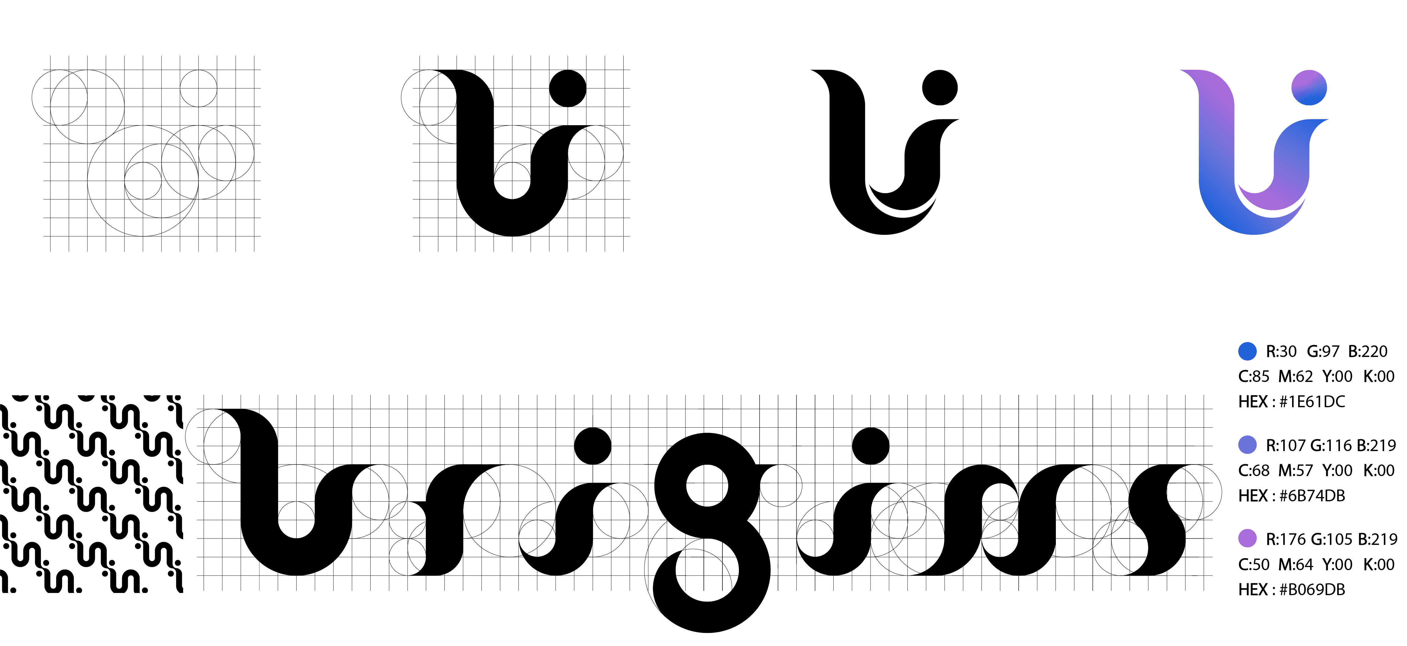
The challenge was to convey both the technological aspect of the platform and the deep emotional resonance of personal history. Early sketches explored abstract representations of roots, branches, and pathways, eventually converging on a symbol that combined a stylized “U” with organic curves and circular forms reflecting continuity, lineage, and inclusivity.
Typography development followed the same philosophy, using geometric proportions to create a cohesive, memorable wordmark that complemented the icon.
Visual Exploration
With the core logo concept set, I refined it using a grid system and circular geometry to ensure precision and scalability. The color palette moved toward a gradient blend of deep blue, soft purple, and vibrant magenta chosen to signify trust, and warmth. The brand pattern evolved from the logo form, enabling flexible application in print and digital contexts.
This phase also included UI/UX consulting, where I advised on integrating brand elements into the site’s navigation, iconography, and user flow for a cohesive digital experience.
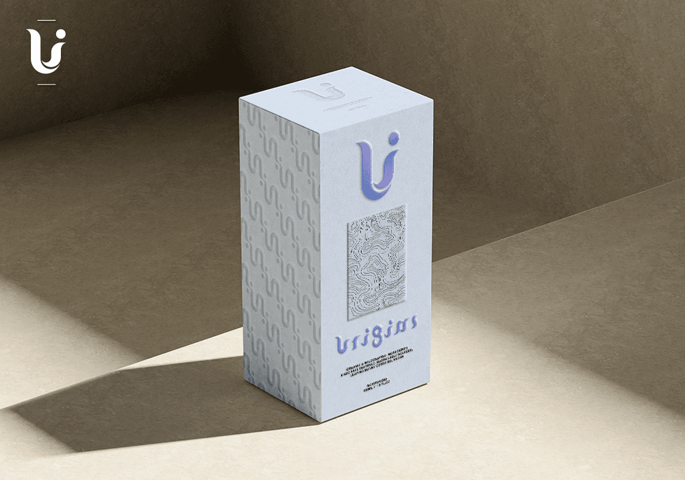
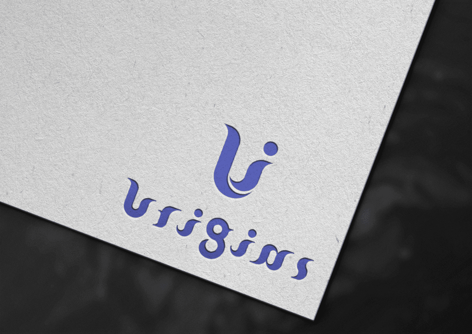
Brand Application
The final identity was applied across multiple touchpoints, from packaging to stationery and the web platform. The logo’s fluid lines and gradient colors translated beautifully into embossed prints and subtle deboss effects, while the pattern worked as a modern, recognizable background texture.
On the digital side, the typography and iconography carried over seamlessly into the website interface, ensuring brand consistency and recognizability at every user interaction.